A histogram is a visual representation of the distribution of a dataset. A histogram represents the frequencies of values of a variable bucketed into ranges. Histogram is similar to bar chat but the difference is it groups the values into continuous ranges. Each bar in histogram represents the height of the number of values present in that range. R histogram is created using hist() function. This function takes a vector as an input and uses some more parameters to plot histograms.
Syntax R Histogram
The basic syntax for creating a R histogram is:
Following is the description of the parameters used:
- v is a vector containing numeric values used in histogram.
- main indicates title of the chart.
- xlab is used to give description of x-axis.
- xlim is used to specify the range of values on the x-axis.
- ylim is used to specify the range of values on the y-axis.
- breaks is nothing but number of bins.
- col is used to set color of the bars.
- border is used to set border color of each bar.
Example of histogram in R :
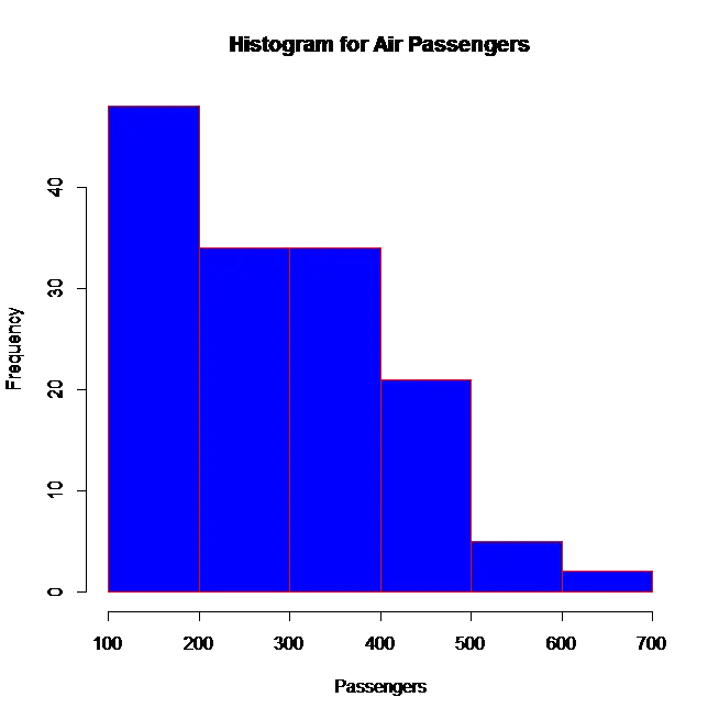
This code computes a histogram of the data values from the dataset named AirPassengers (a default dataset in R)
hist(AirPassengers,main="Histogram for Air Passengers",xlab="Passengers",
border="red",col="blue",xlim=c(100,700),breaks=5)
Here the limit of x axis is from 100 to 700. Number of bins is 5. Border is red in colour and the colour of histogram is blue. When we execute the above code the result will be
![]()
![]()


")
")