In R Bar chart can be created using barplot() function. R can draw both vertical and horizontal bars in the bar chart. Each of the bars can be given different colors. We will also see the example of horizontal bars, vertical bars and stacked bars
Syntax
The basic syntax to create a bar chart in R is:
Following is the description of the parameters used:
- H is a vector or matrix containing numeric values used in bar chart.
- xlab is the label for x axis.
- ylab is the label for y axis.
- main is the title of the bar chart.
- names.arg is a vector of names appearing under each bar.
- col is used to give colors to the bars in the graph.
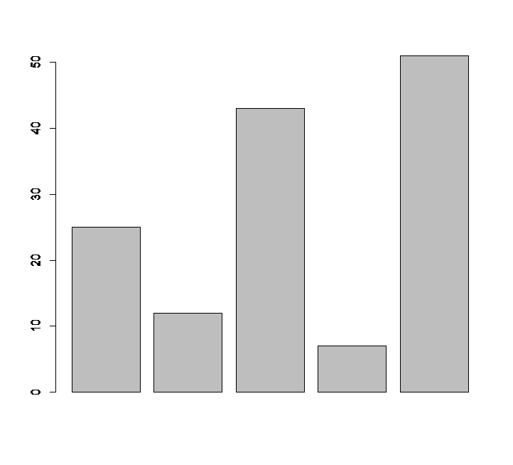
A simple R Bar chart:
A simple bar chart is created using just the input vector and the name of each bar.
# Create the data for the chart.
H <- c(25,12,43,7,51)

# Plot the bar chart.
barplot(H)
When we execute the above code, it produces the following result
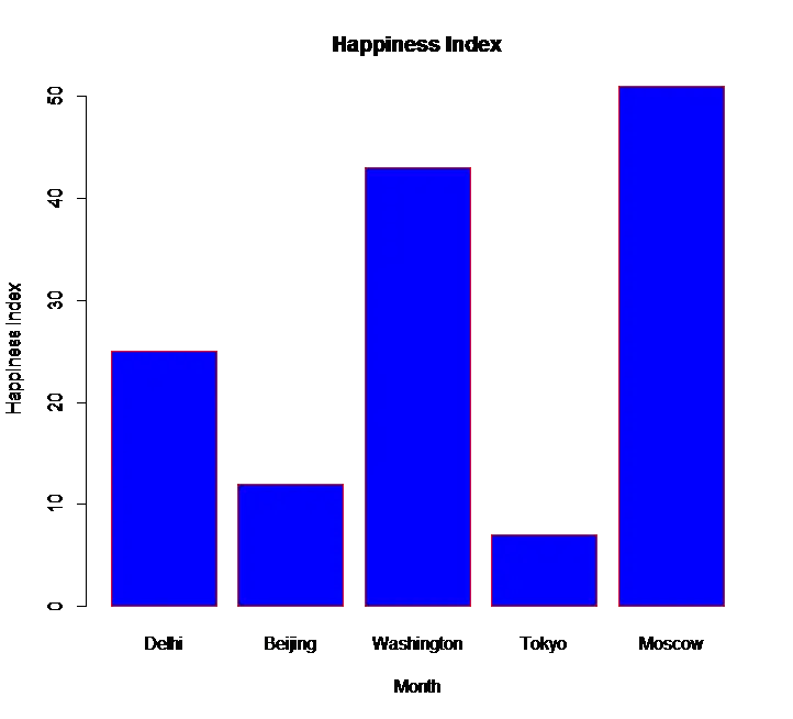
R Bar Chart with Labels, Title and Colours
Bar chart can be expanded and can be made more presentable format by adding additional parameter to the barplot() function
H <- c(25,12,43,7,51)
M <- c("Delhi","Beijing","Washington","Tokyo","Moscow")
barplot(H,xlab="Month",ylab="Happiness Index",col="blue",names.arg=M, main="Happiness Index",border="red")
- First parameter H represents the vector that is to berepresented in Bars
- Second parameter represents the label for x axis
- Third parameter represents the label for y axis
- Fourth parameter is the colour of the barchart
- Fifth parameter are vector of argument names for each bars
- Sixth parameter is the title
- Seventh parameter is for border colours
The output of the above code is
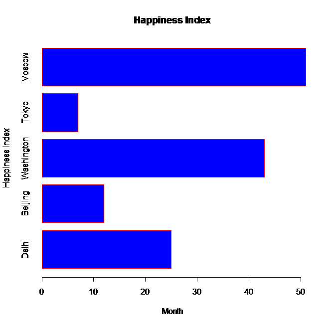
Horizontal R Bar chart:
In the above R bar chart code add an additional parameter horiz=TRUE to produce a horizontal bar chart
# Horizontal bar chart in R
barplot(H,xlab="Month",ylab="Happiness Index", horiz=TRUE,col="blue",names.arg=M, main="Happiness Index",border="red")
the output of the above code is
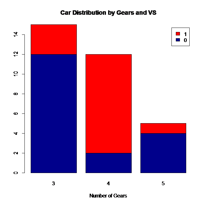
Stacked bar chart in R:
For plotting Stacked bar chart, the first parameter of the function barplot() should be either a table or data frame or matrix
# Stacked Bar Plot with Colors and Legend
counts <- table(mtcars$vs, mtcars$gear)
barplot(counts, main="Car Distribution by Gears and VS",xlab="Number of Gears", col=c("darkblue","red"),legend = rownames(counts))
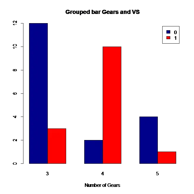
Here the first parameter “counts” that is being passed for barplot() function is a table, which is shown below
| 3 | 4 | 5 | |
| 0 | 12 | 2 | 4 |
| 1 | 3 | 10 | 1 |
The output of above code will be the following stacked bar chart
Grouped bar chart in R:
Grouped bar chart is similar to stacked bar chart. In addition to all the parameters, add an extra parameter beside=TRUE.
# Grouped Bar Plot with Colors and Legend
counts <- table(mtcars$vs, mtcars$gear)
barplot(counts, main="Car Distribution by Gears and VS",xlab="Number of Gears", col=c("darkblue","red"),legend = rownames(counts),beside=TRUE)
Output of above code will be
![]()
![]()


